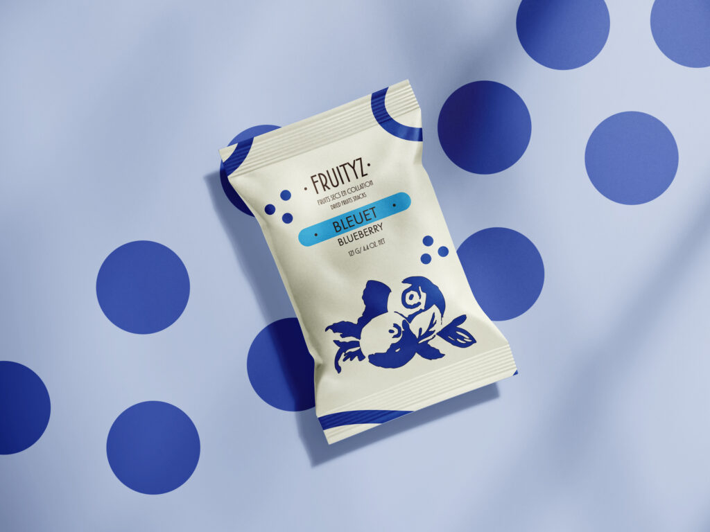
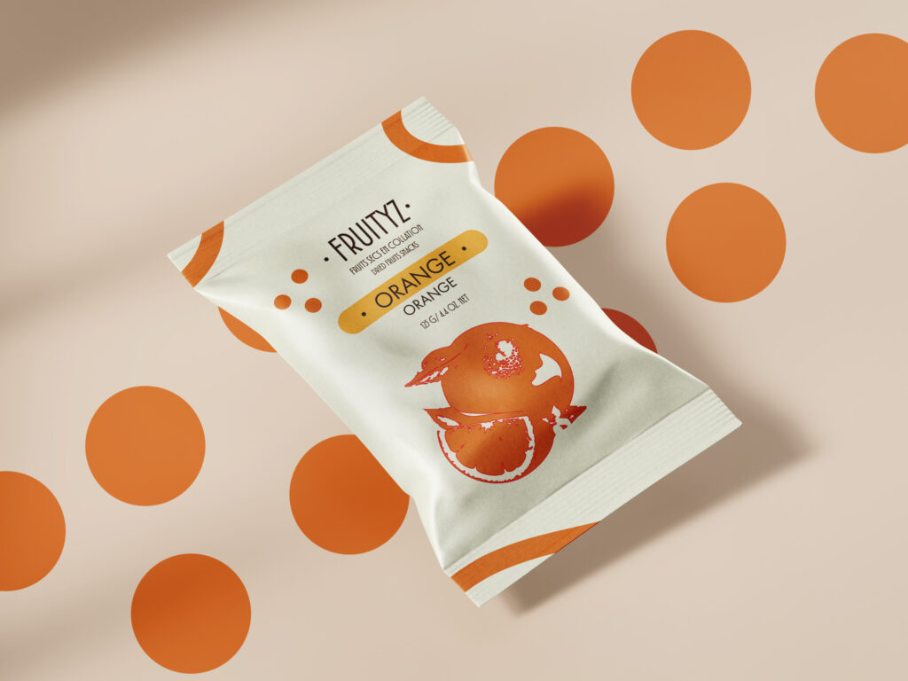
FRUITYZ is a line of naturally dried fruits presented in a clean, organic, and playful packaging concept that highlights the brand’s commitment to sustainability and simplicity. The packaging is made from vegetal-based plastic, offering an eco-friendly alternative to conventional materials while maintaining durability and shelf appeal.
Each flavor — such as raspberry, blueberry, and orange — is visually distinguished through a unique color accent and minimalist fruit illustration. The design combines soft, organic shapes and flowing outlines that echo the natural curves of fruit and plants, creating a sense of freshness and vitality. The cream-toned background enhances the purity of the product, while the fluid color borders — pink for raspberry, blue for blueberry, orange for citrus — bring vibrancy and easy recognition on the shelf. Nutritional information and eco-certifications are neatly placed in structured boxes to maintain balance and clarity. The overall aesthetic emphasizes organic modernity — minimal yet expressive, environmentally conscious yet visually engaging. FRUITYZ packaging not only celebrates natural taste and sustainability but also reflects a joyful connection between design, nature, and responsible consumption.
This project was created as part of a packaging design class where the goal was to develop an eco-friendly packaging concept using materials that are less harmful to the environment. The challenge was to design a product that not only looks appealing but also promotes sustainability through conscious material choices. For this reason, FRUITYZ was developed using vegetal-based plastic, a renewable and biodegradable alternative that reduces environmental impact. The project reflects a balance between aesthetic design and environmental responsibility, showing how creativity can contribute to a more sustainable future.

This moodboard for FRUITYZ captures the visual direction behind the dried fruit packaging design. It blends a palette of warm and natural tones—like earthy oranges, berry pinks, and organic blues—to evoke freshness, vitality, and nature. The imagery focuses on clean, minimal packaging with playful fruit illustrations, reflecting a healthy yet fun lifestyle. The overall aesthetic leans toward modern organic, where simplicity meets vibrancy, emphasizing both eco-friendliness and visual appeal. The soft color contrasts, smooth curves, and balanced compositions convey the brand’s identity as natural, approachable, and full of flavor.
The typography of FRUITYZ reinforces the brand’s natural and approachable identity. The main logo uses a clean, sans-serif typeface with rounded edges, evoking softness and organic simplicity while remaining modern and legible. The combination of bold headers and lighter supporting text creates a clear visual hierarchy, ensuring that both the fruit names and essential product information are easy to read and aesthetically balanced.

The research for the FRUITYZ project focused on developing a modern, eco-friendly packaging concept that combined clean aesthetics with sustainability. Inspiration came from minimalist natural product packaging, soft organic shapes, and fruit-inspired color palettes that reflect freshness and vibrancy. Alongside visual research, studies on vegetal-based plastic revealed its advantages as a renewable, biodegradable material made from plants like corn or sugarcane, offering a lower carbon footprint and reduced environmental impact. This material choice reinforced the brand’s commitment to sustainable design and conscious consumerism, merging style with environmental responsibility.