ALL ACCESS is a youth-oriented magazine designed to highlight Montréal, Île-Perrot, and the surrounding areas through a vibrant, energetic visual style. Created as a group project, this section represents my individual contribution and creative approach to the magazine’s branding and layout. Aimed at older teens and young adults, the magazine focuses on relatable content—local hangouts, food spots, photography, and lifestyle features—reflecting the everyday interests of this age group.
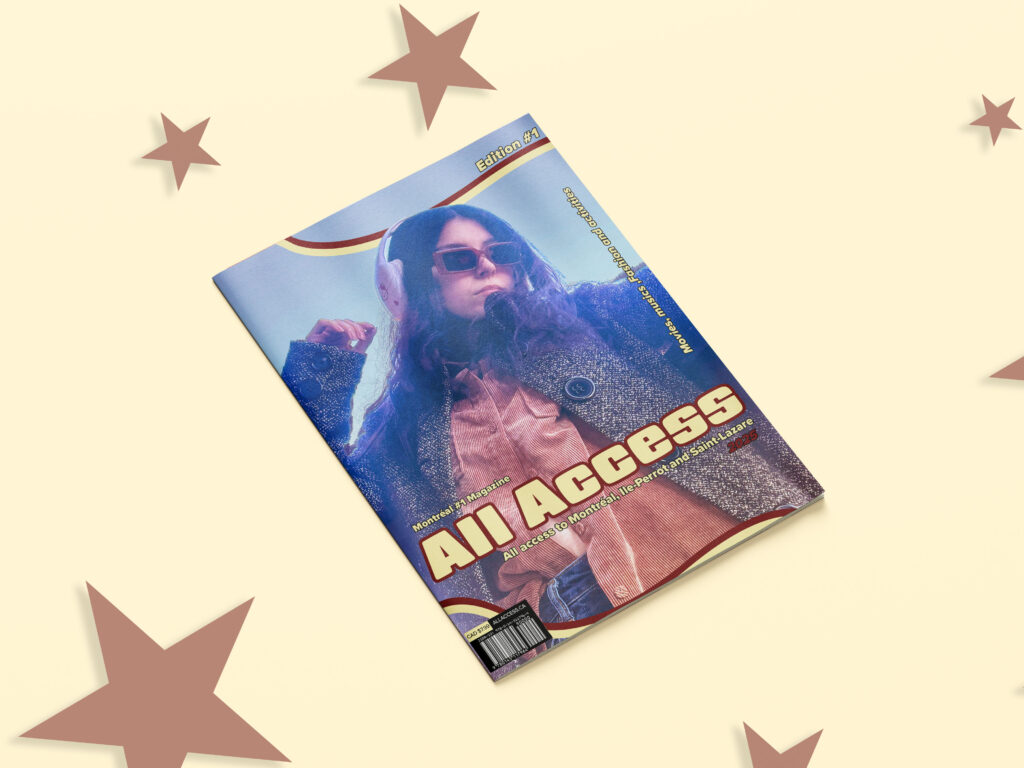
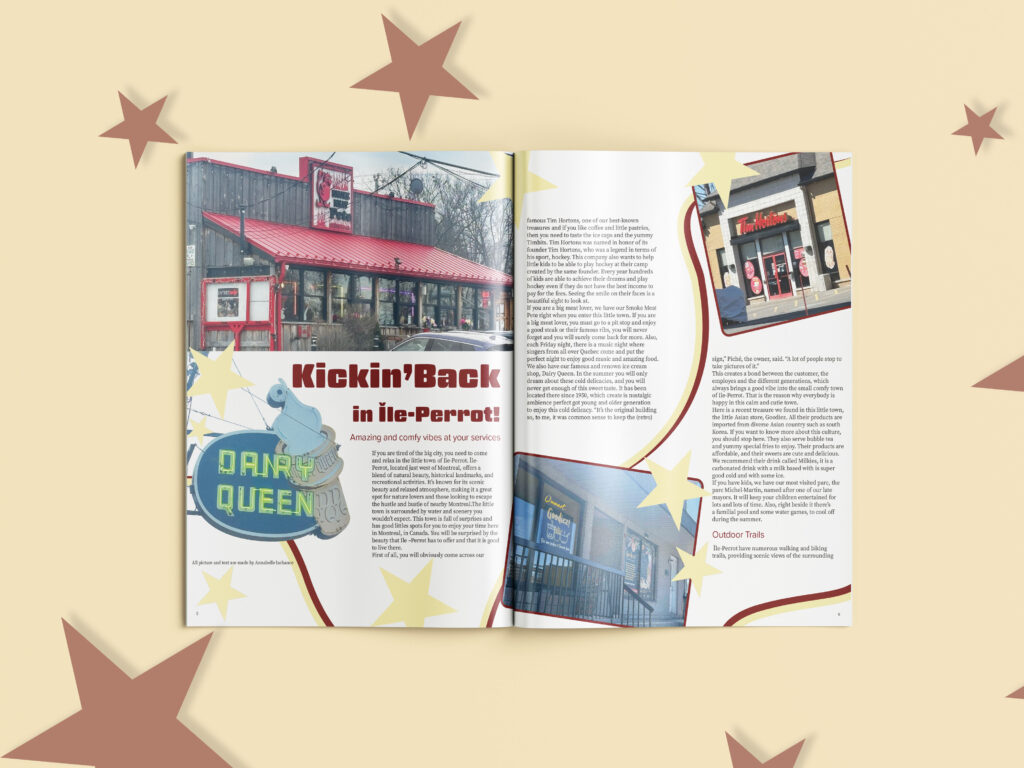
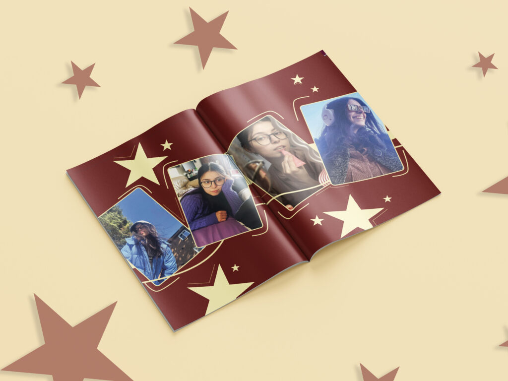
The color palette combines warm creams, deep reds, and soft browns, creating a retro-inspired, welcoming tone that feels nostalgic yet modern. Star motifs, rounded frames, and dynamic compositions add a playful, approachable identity while maintaining readability and structure. My design decisions were guided by research into youth-driven magazines and pop-culture visual trends, particularly how bold typography, expressive graphics, and immersive imagery keep younger audiences engaged.

This moodboard captures the vibrant, nostalgic energy of early-2000s teen magazines, blending bold colors, playful star motifs, and expressive editorial layouts. It draws inspiration from Bratz-era graphics, retro street photography, and dynamic celebrity spreads to create a fun, youthful aesthetic that feels both nostalgic and fresh. The mix of bright reds, yellows, and soft neutrals reinforces a lively, expressive tone that aligns perfectly with a magazine aimed at older teens and young adults.

Typography plays a major role in defining the magazine’s personality. The headline typeface is thick, rounded, and bold, inspired by early-2000s editorial styles that resonate with today’s young adult nostalgia. Its soft edges keep it friendly and eye-catching, while a clean sans-serif body font ensures easy reading throughout the articles. This contrast between retro headlines and modern text creates a balance of fun and clarity that supports the magazine’s overall aesthetic.
Research into the target demographic showed that readers aged 16–25 value authenticity, visually rich storytelling, and content that reflects their own communities. This informed my choices in candid photography, conversational language, and the overall tone of the layouts. Overall, ALL ACCESS blends fun, accessible design with thoughtful audience research—and this portion of the project showcases my personal stylistic interpretation within the collaborative magazine.