About This Project
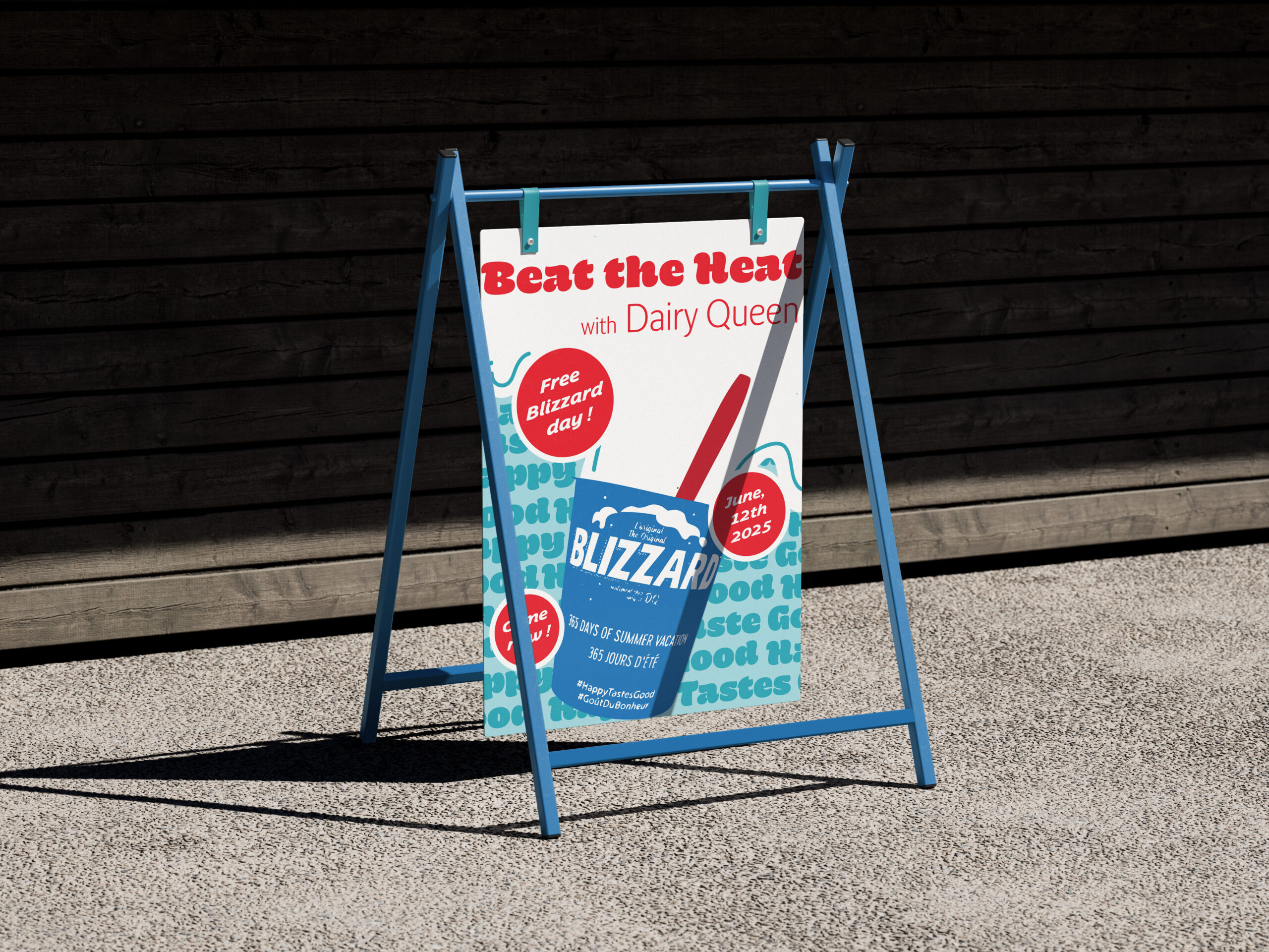
This ad was for a magazine project and it needed to be an illustrated one. What. I did is that I took a picture of the ice cream pot and I image traced it to match it to the colour of the brand, which is blue and red. I kept the colour palette simple, only three colour, to not be overwhelming, because the design takes a lot of the space. Also, I did not want to keep to much of white space, so I have added in the back the slogan of the brand, which add a pattern at the back and the said back does not look empty and boring. On top of the illustration, there is “bubbles” of text to make it fun, and kinda childish, to make the people have this nostalgic feeling when they go and get an ice cream with there family members. The big title is infant of the ice cream coming out of the ice cream put to again man is playful, and match with the idea that when the temperature is hot, you go and take this sweet dessert, but it is melting everywhere.