The visual identity for Café Addict is a vibrant exercise in “Neo-Diner” nostalgia, successfully bridging the gap between 1950s Americana and contemporary maximalism. The project’s core is built around a high-contrast palette of electric bubblegum pink and deep Mediterranean teal, an unconventional pairing that subverts the traditional red-and-chrome diner aesthetic for a more youthful, trendy appeal.

THE COLOUR PALETTE AND PATTERN

This color story is supported by the iconic checkerboard pattern, a quintessential retro motif that provides a structured, geometric foundation to the layouts, anchoring the more fluid elements of the brand.

DESIGN CHOICE

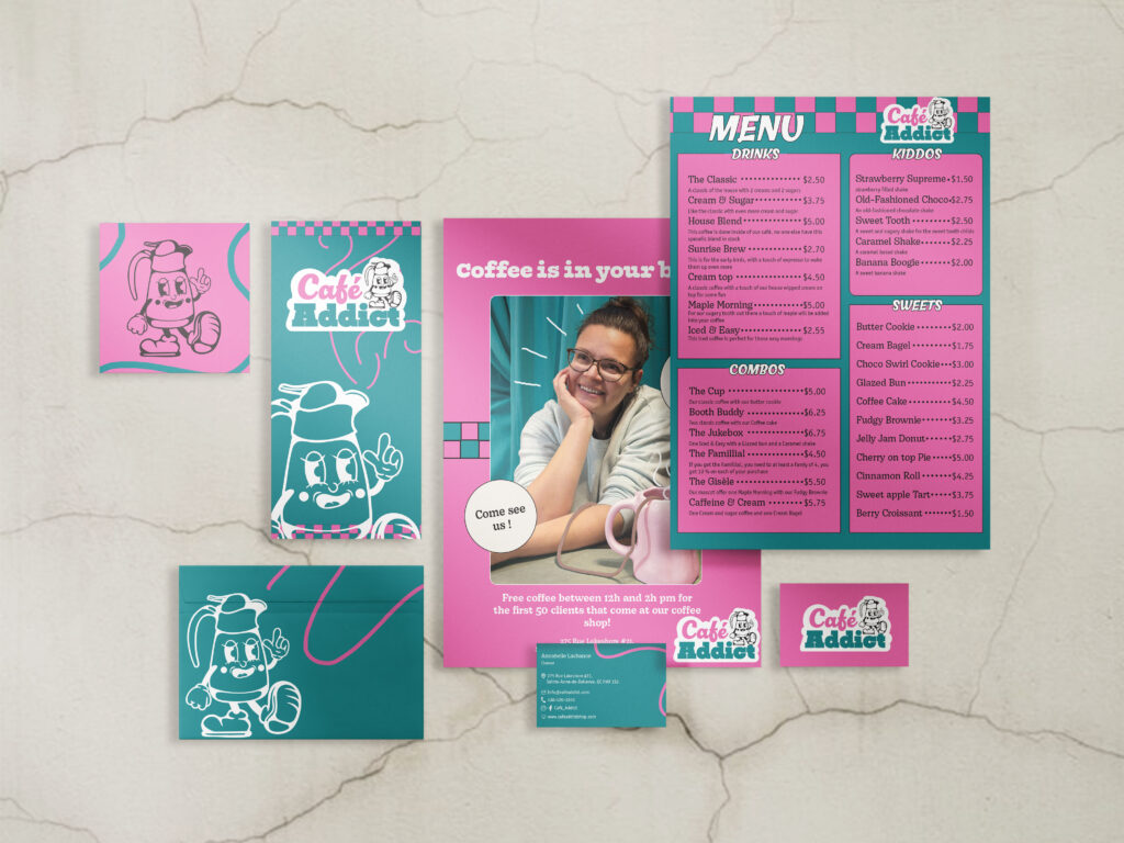
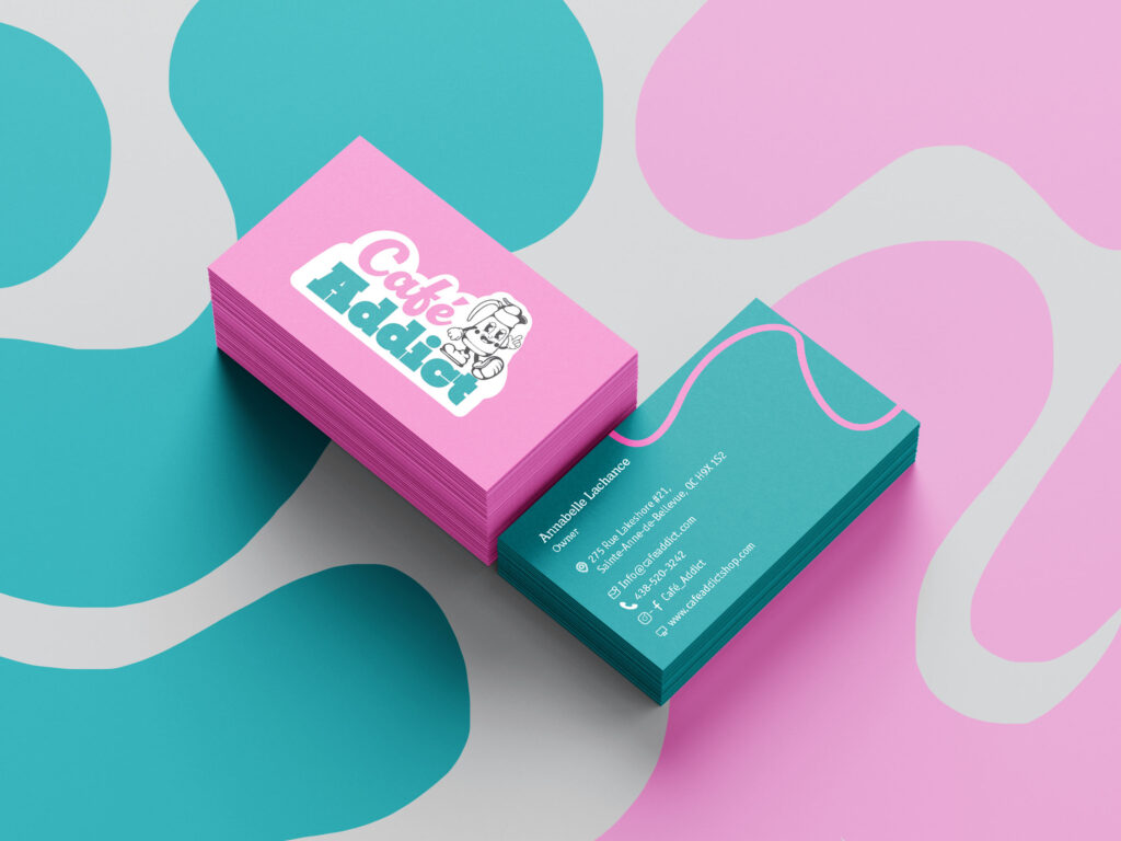
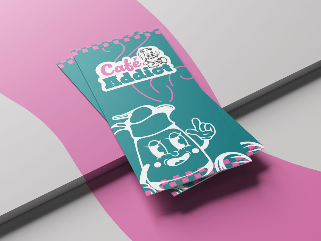
At the heart of the branding is Gisèle, a custom-illustrated mascot in the “Rubber Hose” animation style. This anthropomorphic coffee pot embodies the charismatic, community-focused spirit of mid-century service. The logo typography utilizes a heavyweight, rounded slab serif with a pronounced drop shadow, mimicking the dimensional neon signage of the era. To balance the rigidity of the grid-based patterns, organic squiggly lines are integrated throughout the stationery. These lines serve a dual purpose: they function as a rhythmic graphic device to lead the eye while metaphorically representing the rising steam of a fresh brew, adding a sense of warmth and movement to the static print materials.

MOODBOARD

This moodboard illustrates the visual research for Café Addict, showcasing the transition from mid-century diner inspiration to a contemporary, high-energy brand identity. It captures the essential design elements, including the bold pink and dark teal color palette, checkerboard patterns, and retro-inspired interiors that informed the final stationery and mascot design. By synthesizing these references, the board establishes a “Neo-Diner” aesthetic that balances 1950s nostalgia with modern graphic sensibilities.

TYPOGRAPHY

The typography across the menu and business cards employs a hierarchy that favors bold, sans-serif headers for maximum legibility, paired with clean secondary type to manage the “loud” visual environment. Every touchpoint, from the trifold brochures to the envelopes, maintains a meticulous balance between retro kitsch and modern minimalism

 The result is a cohesive, high-energy brand ecosystem that feels both storied and fresh, proving that vintage tropes can be effectively recontextualized through daring color theory and playful character design.