About This Project
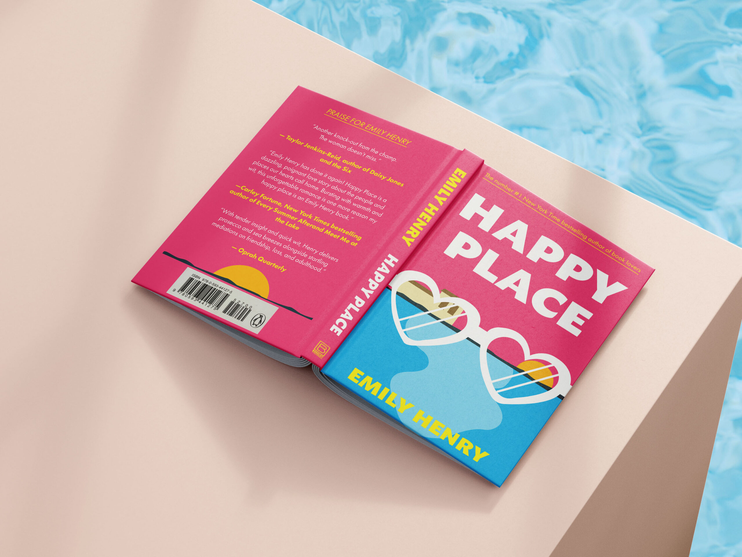
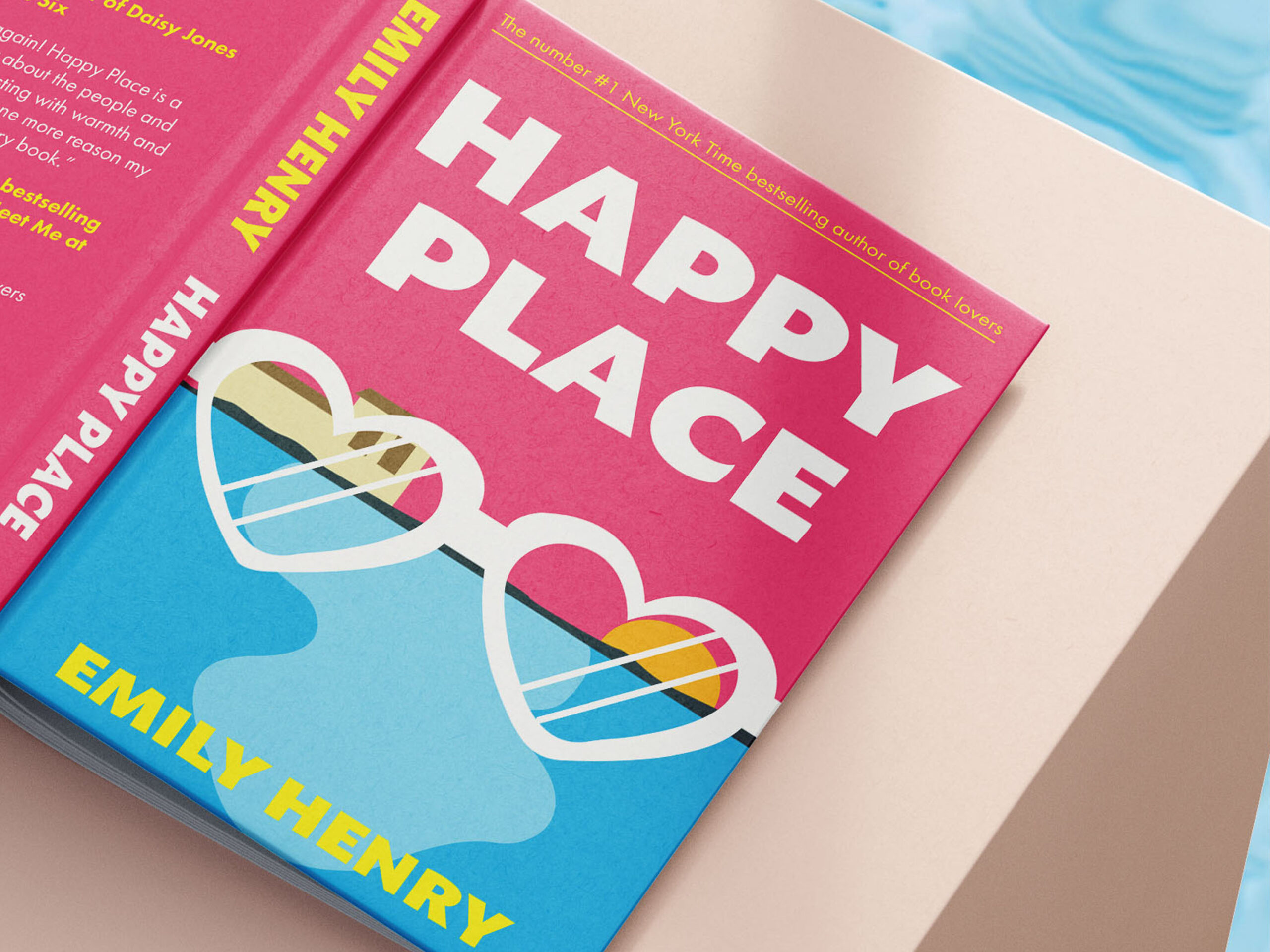
This project is a vibrant redesign inspired by Happy Place by Emily Henry, capturing the novel’s joyful, summery energy through bold colour, playful illustration, and a bright, modern layout. The design focuses on creating an instantly uplifting visual experience by using saturated pinks, warm yellows, and refreshing aqua blues colours that evoke sunshine, beaches, and the warm nostalgia of a perfect vacation. The cover illustration, featuring heart-shaped sunglasses reflecting a sunset, symbolizes both escapism and emotional warmth, which are central themes in the story. Clean geometric shapes, subtle waves, and rounded forms soften the composition and create a sense of movement, echoing the lighthearted rhythm of a summer romance.
DETAILS OF DESIGN
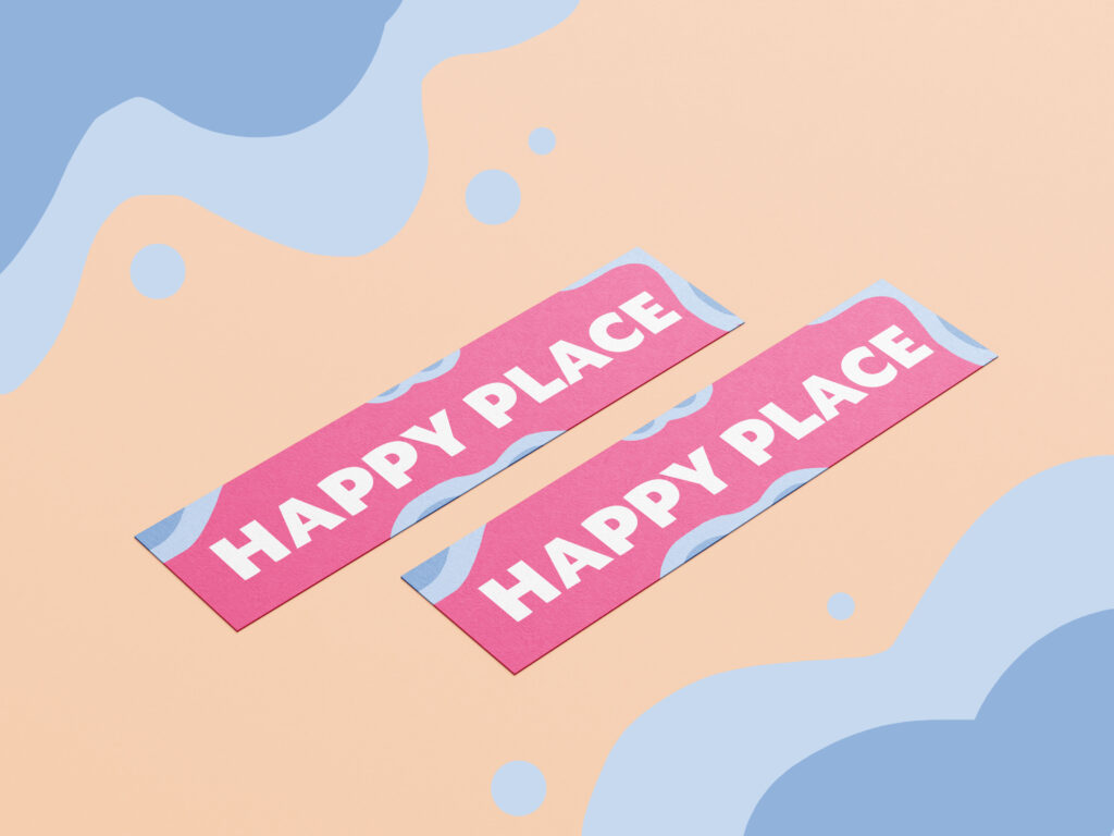
The project extends beyond the cover to include coordinated collateral, such as bookmarks and promotional graphics, designed with consistent shapes, colours, and typography. This cohesive visual language strengthens the identity of the novel and reflects the cheerful, comforting world Emily Henry creates. Overall, the design aims to spark happiness at first glance, immediately transporting the viewer into the book’s “happy place.”
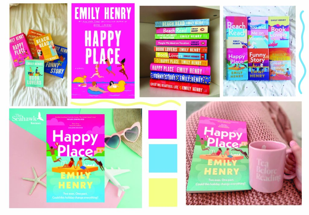
MOODBOARD

The moodboard combines bright, beachy imagery, bold pinks and blues, and snapshots of Emily Henry’s other book covers to establish a cohesive visual identity. It highlights the playful, summery aesthetic that characterizes her brand while emphasizing warm, uplifting storytelling. The selected color palette reinforces themes of joy, sunshine, and emotional lightness.
TYPOGRAPHY

The typography is bold, clean, and modern, using strong sans-serif lettering to ensure high visibility and an energetic tone. This style supports the playful, contemporary vibe of the design while keeping the title easy to read across formats. The type’s simplicity balances the bright visuals, creating a polished and cheerful overall look.


