IDEA BEHIND THE DESIGN

This logo was designed to reflect a personal brand rooted in simplicity, elegance, and visual pleasure, while remaining practical for everyday use. Using my last name, Lachance, as the central identity was a deliberate choice: it is distinctive, memorable, and easily adaptable across different contexts, from professional branding to casual applications. The typography plays a key role in expressing this idea.

COLOUR PALETTE

The restrained color palette—primarily black, white, and soft accent colors—supports the idea of simplicity and elegance, while also allowing the logo to adapt seamlessly to different media. Overall, the logo represents me as a designer who values clarity, beauty, and intention. It communicates a calm confidence and an appreciation for refined aesthetics, while remaining approachable and functional.

TYPOGRAPHY

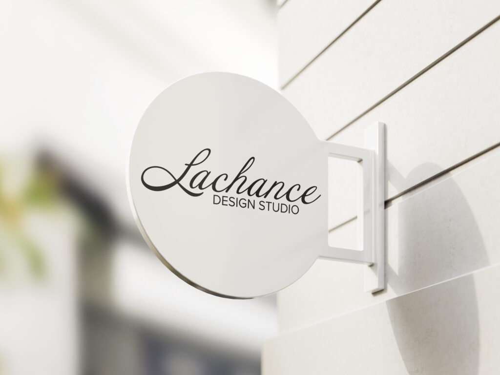
The typography plays a key role in expressing this idea. A refined script typeface was chosen for the wordmark to convey elegance, creativity, and a sense of craftsmanship. Its fluid curves and graceful connections give the logo a timeless quality, making it “pretty to look at” while avoiding excess ornamentation. This softness contrasts beautifully with the clean, minimal supporting text, which adds structure and balance, ensuring the logo remains legible and versatile. The subtle variations of the letter “L” act as a flexible visual signature, allowing the identity to function both as a full logo and as a standalone mark. The inclusion of a small floral symbol reinforces the brand’s delicate and thoughtful character, symbolizing creativity, growth, and attention to detail without overwhelming the composition.

Overall, the logo represents me as a designer who values clarity, beauty, and intention. It communicates a calm confidence and an appreciation for refined aesthetics, while remaining approachable and functional. By focusing on a clean typographic foundation and a brandable last name, the identity achieves a balance between personal expression and professional usability, making it both visually appealing and enduring.