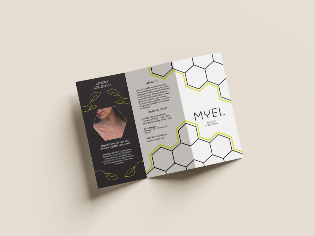
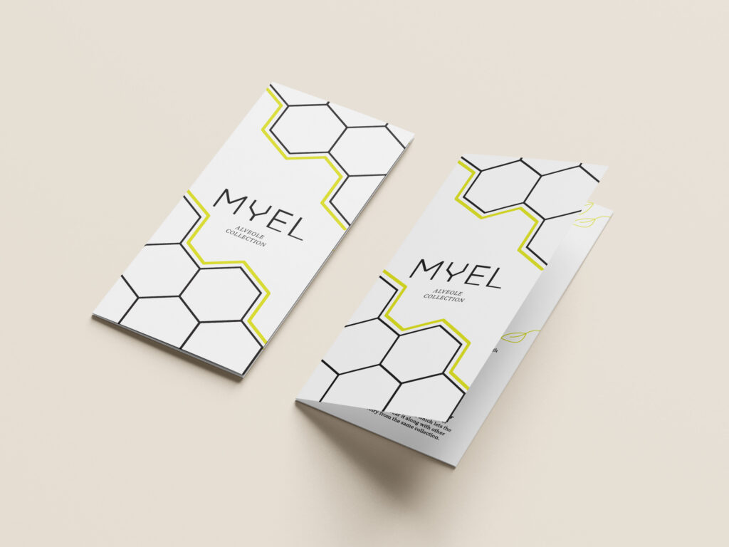
The visual strategy for the MYEL trifold brochure, specifically highlighting the Alveole collection, is rooted in a refined, minimalist aesthetic that mirrors the elegance of Montreal’s high-end jewelry scene. The design utilizes a sophisticated palette of stark white, deep charcoal black, and a vibrant lime-yellow accent. This specific choice of lime-yellow serves as a modern, energetic nod to the “Alveole” theme—referencing the natural vitality of honeycombs—while the heavy use of white space ensures the jewelry remains the primary focal point, adhering to the brand’s core principle of clean, understated luxury.