This project was created as part of a packaging design class, where the goal was to develop a product specifically targeted toward children. I designed Splashie, a fun and gentle soap brand for kids, inspired by playful sea creatures and ocean life. The design combines soft pastel colors and friendly typography to create a comforting and engaging visual experience, making bath time enjoyable while maintaining a clean and modern aesthetic suitable for young audiences.

COLOURS

This packaging design for Splashie, a body care brand for young children, embodies a playful underwater theme that merges fun, comfort, and cleanliness in one cohesive visual system. The concept draws inspiration from ocean life and beach imagery, creating a cheerful and engaging experience that captures a child’s imagination. 

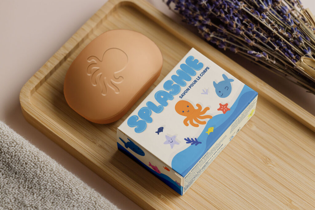
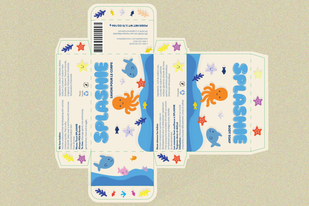
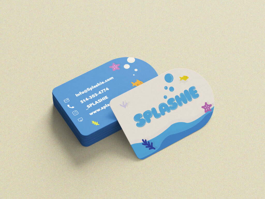
The packaging features friendly sea creatures, including an octopus, starfish, and fish, illustrated in a soft, rounded style to evoke approachability and warmth. The colour palette—a mix of vibrant blues, sandy beiges, and coral accents—is intentionally chosen to reflect the soothing tones of water and sand while maintaining a visually stimulating and kid-friendly appeal. 

DETAILS AND DESIGN

A key detail that enhances the cohesiveness of the branding is the engraved octopus motif on the soap itself, which extends the underwater storytelling into the product’s physical form. This tactile element adds a sensory dimension, making the product both visually and experientially engaging for children. The overall design achieves a harmonious balance between functionality and storytelling, with clear, legible labeling and a visual language that communicates safety,

gentleness, and fun.

MOODBOARD

The moodboard for Splashie focuses on soft, playful aesthetics inspired by baby and kids’ skincare packaging. It uses a pastel color palette of blues, oranges, and creams to create a calming, ocean-inspired feel that evokes cleanliness and fun. The rounded shapes, friendly illustrations, and gentle typography choices reflect a design language that is approachable and safe for children while keeping a modern, cohesive visual appeal.

TYPOGRAPHY

The typography of SPLASHIE is playful and rounded, echoing the softness and fluidity of water splashes. Its bubbly letterforms create a friendly and approachable tone that perfectly suits a children’s soap brand. The use of a bold, blue typeface enhances readability while reinforcing the aquatic theme and freshness of the product.

RESEARCH

The research for Splashie focused on understanding what visually attracts children, from bright, playful colors to bold shapes that feel energetic and fun. I explored a wide range of palettes and brainstormed brandable names that were easy to pronounce, memorable, and appealing to a young audience. I also experimented with different product sizes to find one that felt comfortable for kids to hold while still standing out on the shelf.